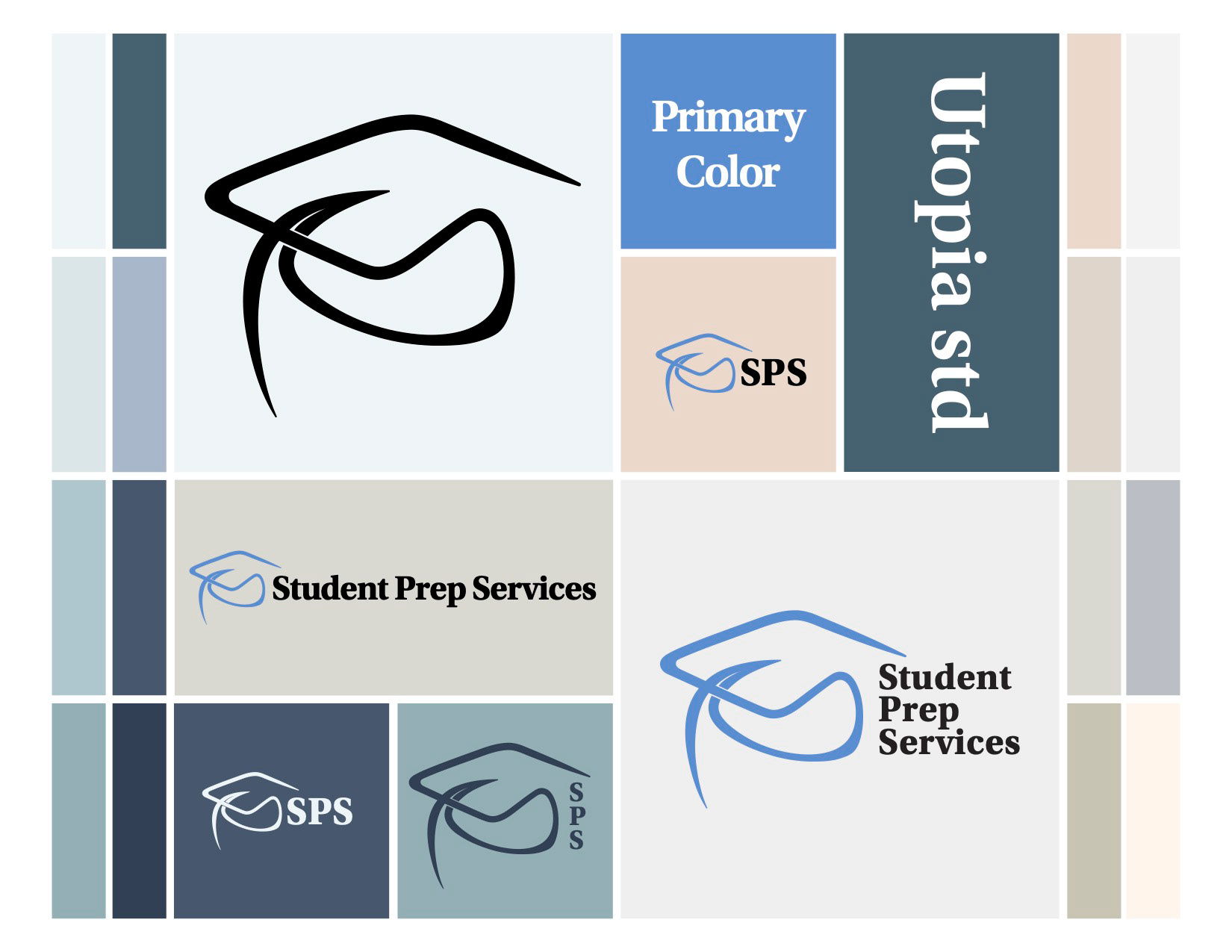


SPS Icon

Main Logo

Alternate Version 1

Alternate Version 2

Banner Logo


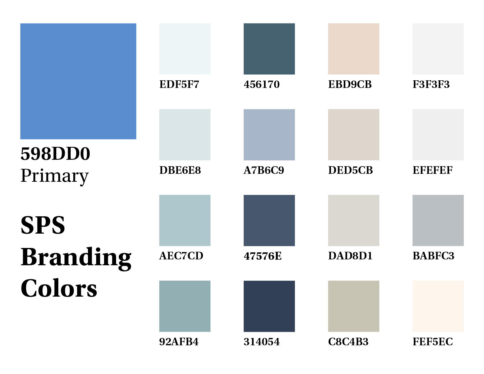
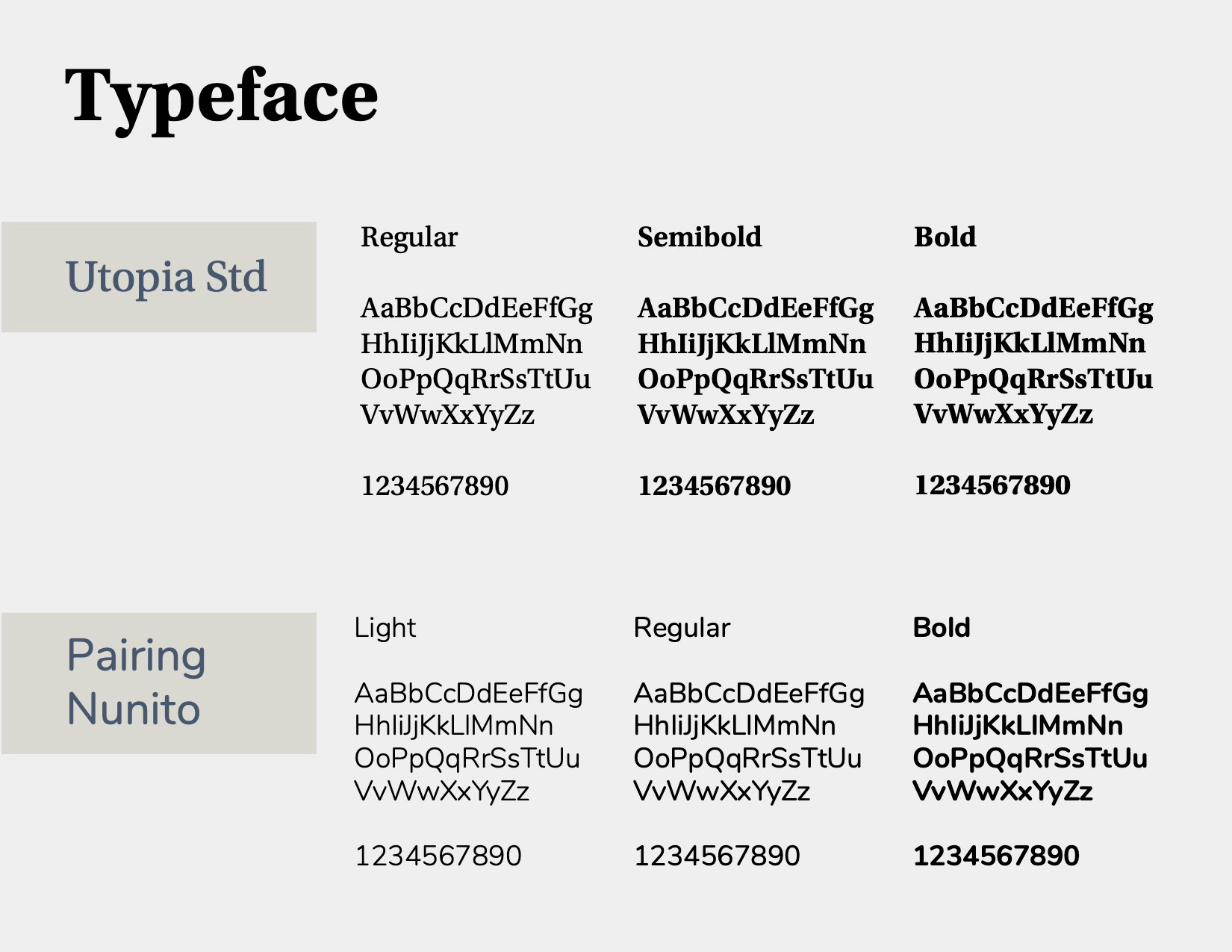
For this client, I rebranded their image through logo revision and created a marketing identity based on this new logo and visual system. The client wanted the imagery of the mortarboard hat to remain part of the logo, so in the redesign, I kept close to the original design of the hat while also striving to make a visually stronger icon. Below you can see the before and after of the logo design, the final rebranding includes a multitude of logo variations for different purposes and formats. This process also included a branding identity system for consistent use across social and media platforms and any other marketing use they might need. This includes specified typeface usage, a branding color palette, and a pattern incorporating their logo.

