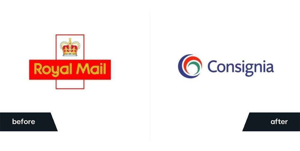
Original Design vs Failed Redesign
![](https://cdn.myportfolio.com/a65e1b56-bfb0-4926-be1f-6fb15f316b82/d9ed240e-0df1-45ba-b1f9-a74386264453_rw_1200.jpeg?h=9a54c1d1a8a9e94aa8d5e2053026dcef)
My Solution
![](https://cdn.myportfolio.com/a65e1b56-bfb0-4926-be1f-6fb15f316b82/2047b8f2-035d-47b5-9271-26ee68c38f8b_rw_1920.png?h=0c0ad4074a5bffa913a1af9a964b61a8)
![](https://cdn.myportfolio.com/a65e1b56-bfb0-4926-be1f-6fb15f316b82/d2ff110b-8dd3-455e-9cad-b25c3c283782_rw_3840.png?h=806f5235321f4a556732c4415cc18300)
![](https://cdn.myportfolio.com/a65e1b56-bfb0-4926-be1f-6fb15f316b82/38829b62-8c26-4d15-93dd-9ec0c12dd7ad_rw_1920.png?h=4246c8e3ea4f71b3cf96f5675f7b0ac8)
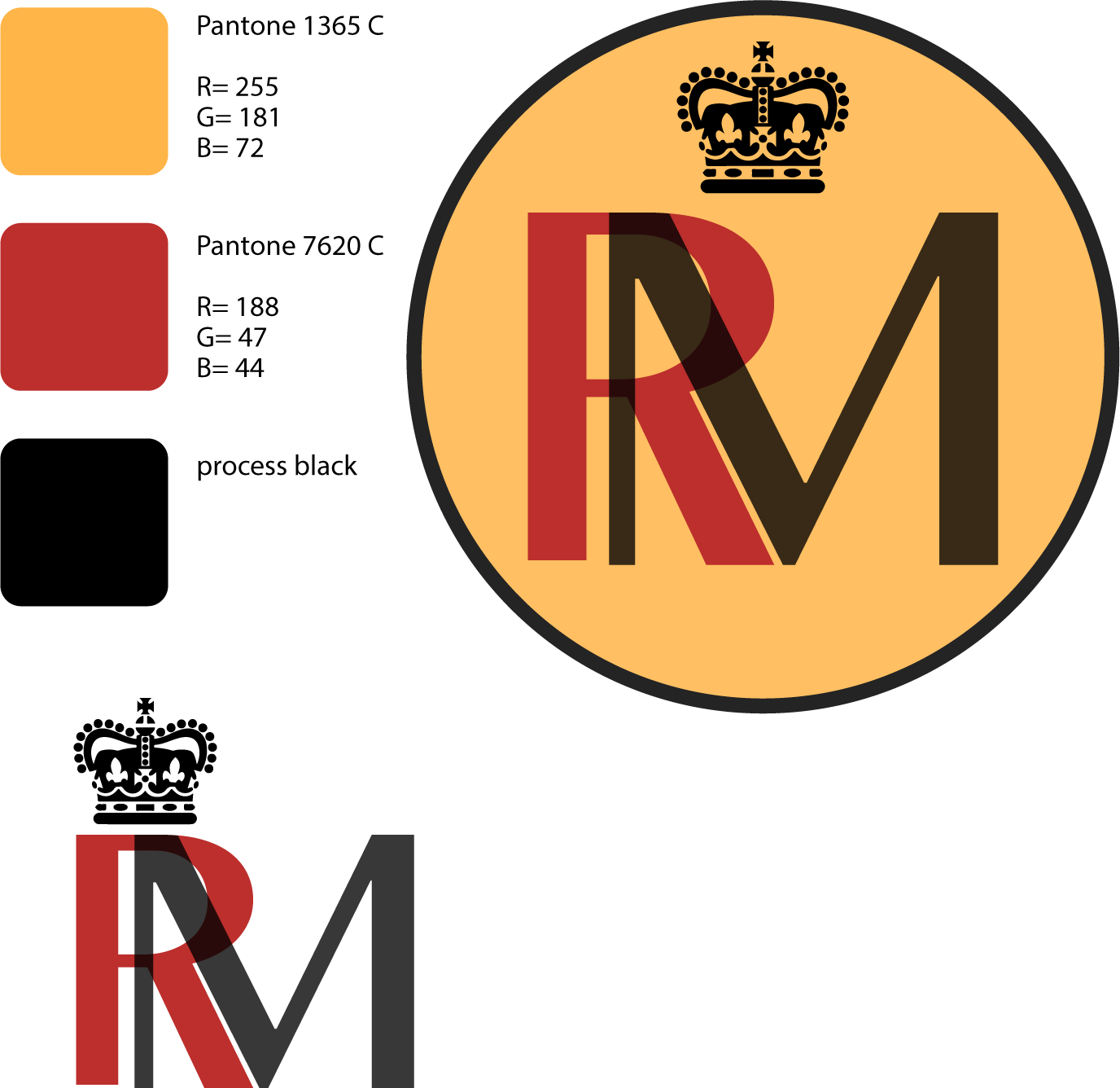
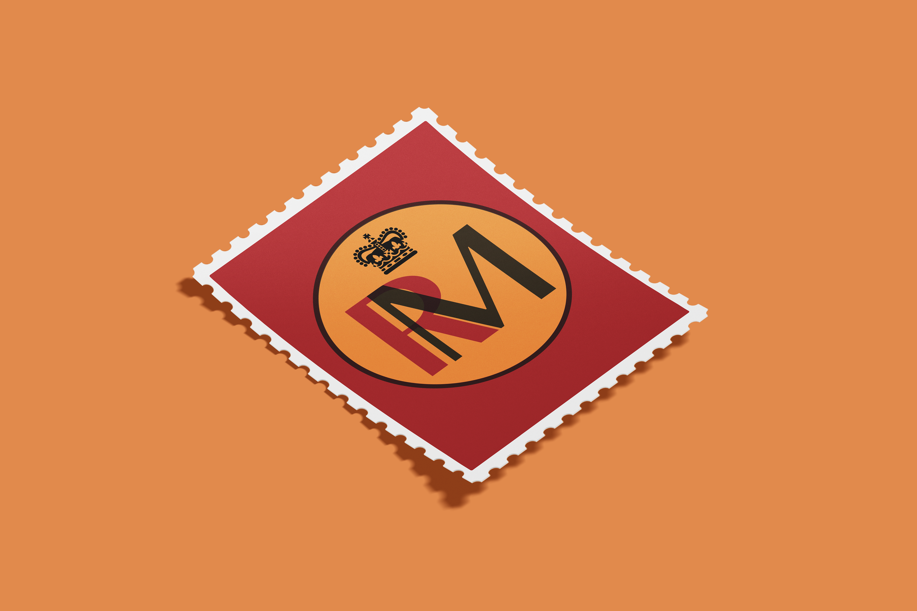
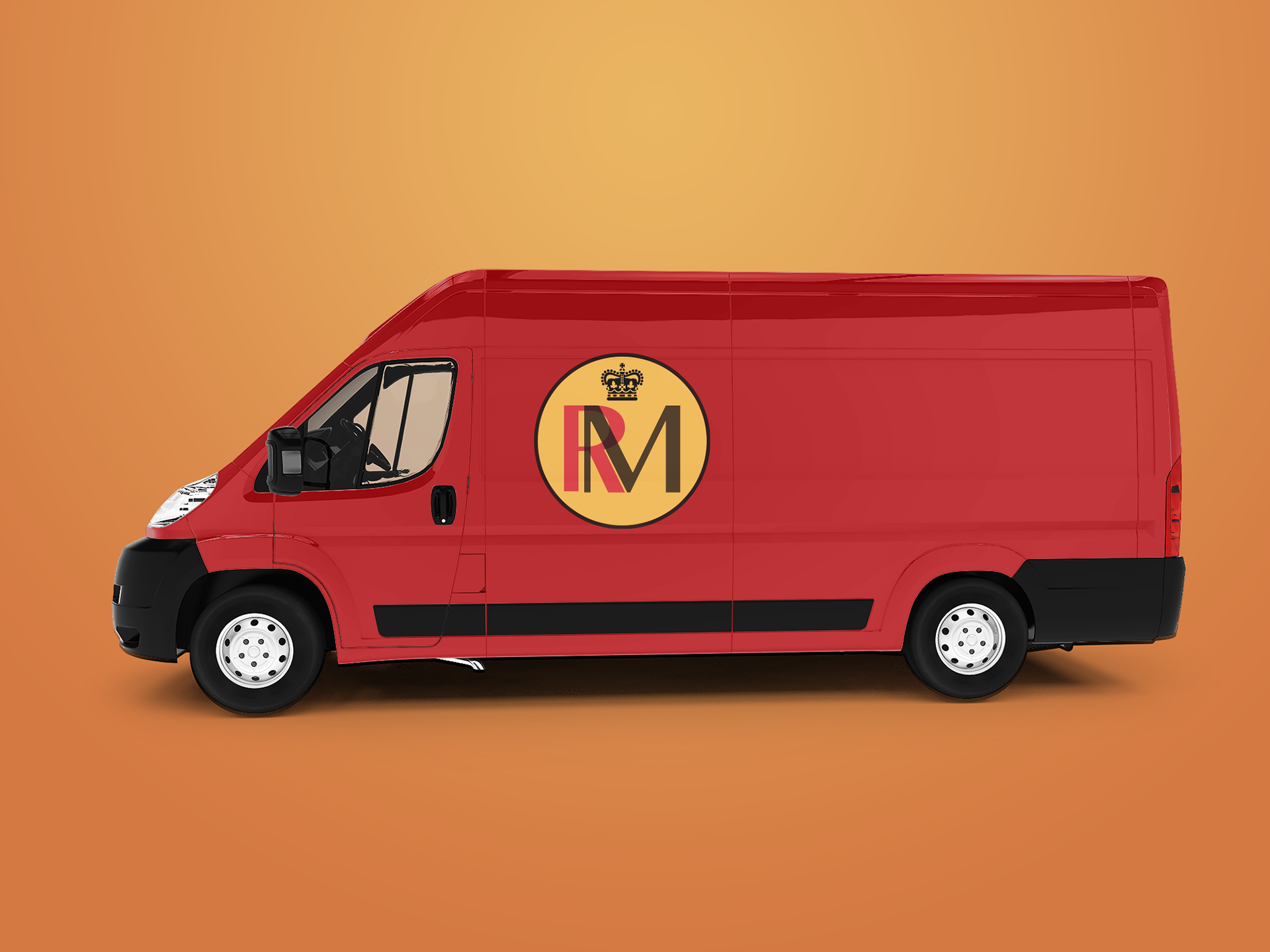
This project was a redesign of the British Service Royal Mail in an attempt to resolve a failed logo redesign the company went through in which they chose to return to their original design. I chose to rebrand the company with a simple but elegant look, keeping the royal crown and austerity while modernizing and simplifying the logo. The logo was made in Illustrator and the mockups in Photoshop.